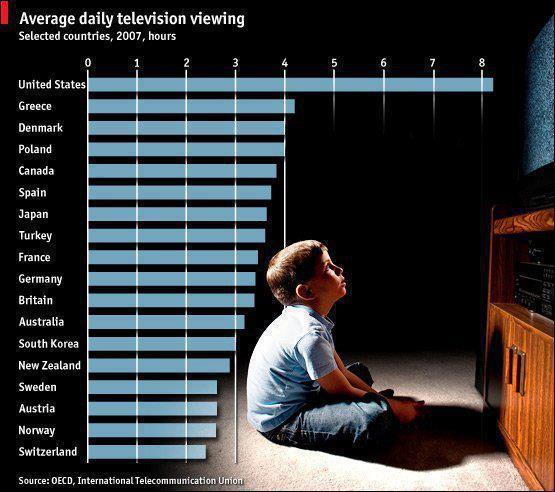
I came across the following chart the other day. I tried tracking back the source, but only found sites who had also posted the image, and found the same thing everywhere I went: People were primarily discussing how much television children should watch and sharing their own parental practices and expectations.

I apparently was the only one who thought this was odd, since nowhere on the chart did it indicate the age range (if any) by which the statistics referred. On top of this, I also looked for the date, noting it was at the advent of social media, and therefore doubtfully representative of today.
This is perhaps another example of the brain engaging emotions based on what it sees rather than analyzing what it understands. While my brain was dissecting the data, looking for context and noting what was missing, the debate went on, along with comments about whose country was better and if they should believe or reject (what they thought) the chart was saying.
It is amazing that an image can change context of what is supposed to be objective data. What if the child were dark-skinned? Would the dialogue form around ethnic disparity due to upbringing? What if it were an old woman in a wheelchair? Would one automatically assume that the elderly watch more television and that was the point of the chart?
I know everyone’s mind isn’t trained to look and not merely see, but the fact this is so makes for an easy effort on the part of every propagandist for any and every cause. Maybe it’s because, as children, we watch too much TV.

