

If you think statistics are great conversation starters (or debate enders), just think of what a chart (or map) can do. They say a picture is worth a thousand words, but sometimes there’s no telling what exactly those words are.

Of Homicides and Presidents
To the Right of me, I find a map portraying that counties that voted for Obama had an average murder rate 13 TIMES HIGHER than counties who voted for McCain. And I have to admit here I capitalized those words to make it sound more impressive and shocking, though it really means nothing, since (1) it was a hoax (replayed from the 2000 election), and (2) had the actual numbers been correct, there is no reasonable conclusion one can draw from it.
Yes, there IS a generally a higher homicide rate in “Blue” counties. And it makes sense when you figure in that higher population densities correlate with higher violent crime rates, and these urban areas tend to be Liberal. Why? My explanation is that in more populous areas, social justice and interdependence are more pressing than individual freedoms and self-responsibility. This isn’t meant as a judgment for or against Liberalism or Conservatism, just an honest observation that different environments drive different values over others.
In the Red or in the Blue?
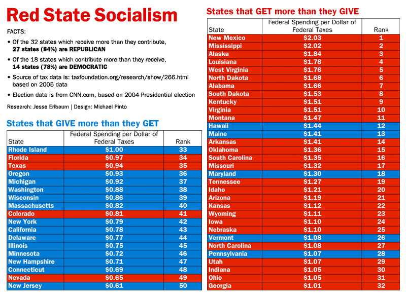 But to the Left of me, we have a more interesting map, in far less detail, but instead of being debunked, was merely deconstructed, leaving us with more questions than answers. And I say “interesting” because that’s all you can really say about it. It doesn’t tell a story, though the creator’s conclusion is pretty obvious given the title of the chart, “Red State Socialism”.
When you look closely, you can see that this was not a real ‘study’ but a rehashing of simple data compiled by a single source, the “Tax Foundation”. Unfortunately, they reveal no methodology whatsoever, leaving us to wonder how the numbers were derived and what determining factors were found or even considered.
And there’s not even an attempt at context or explanation by the color chart’s creator, Jesse Erlbaum, who basically writes off any attempt at breaking down the numbers to be “rationalizations”. Way to keep an open mind, Jesse. And while he is sticking his fingers in his ears saying “the data is what it is”, let’s actually look at it and think about it.
Meaninglessness
First, let’s look at the most basic flaw: Red and Blue designations are based on the voting trends of a single, federal election. There is some overlap to be sure with standard consideration for what are “welfare states” such as New York and California — hence the effective use of the chart to buck a stereotype — but we’re trying to correlate state voter behavior with nationally-controlled income and expenditure. And as Politifact points out, even one election cycle can easily shift a number of these states from one column to the other.
So even if we look at actual party dominance on the state level, we would not find it pertinent to federal disbursement and taxation. Such things ARE pertinent to things like cost of living and wages, and STATE-level entitlements. But they have no means of control over their citizen’s tithing to DC on their 1040s. Or is there some funding that states control (amount, not merely discretionary allocation) with regard to receiving or paying to the feds? I would think that would fall under the machinations of their federal congressional representatives at best, which we touch upon in a moment.
Secondly, there’s absolutely no breakdown of either income (corporate versus income taxes) or expenditure, which may or may not include a multitude of things. As far as where the “received” money goes, be it infrastructure, education, patronage jobs, special interests, etc., knowing these things would give us a clue, and if it really is a Blue/Red issue. Even before reading the Politifact evaluation, I had asjked the obvious questions if it included military installations as expenditures, which could throw the whole thing off. How about public contractors? Farm subsidies would push the average Red state farther toward the receiving side of things, wouldn’t it?
In other words, the data could actually demonstrate how our lives are affected, possibly meaning very different things, depending on what is included or excluded in those numbers. WHERE the money is going and why could paint a completely different picture than the apparent intention of the compositor of the data — there are just so many funds, subsidies, entitlements, and grants of every kind that even if the data were researched, untangling it into meaningful understanding might be a fool’s errand.
And an important limitation of the data to note is that some states had a very slim majority vote and there’s no comparison between margin and the degree of spending/funding disparity — if even that would be really all that meaningful.
Meaning
But let’s look at what we DO know.
Blue states tend to have two characteristics: higher household incomes and higher population densities. They includes more people with higher brackets paying progressive rates, and infrastructure and other services cost less per capita. If these are significant factors — and I believe they are — then the imbalance could be quite natural, and the cause and effect as related to party is indirect, much like the aforementioned issue of murder rates. And even apart from the command of higher pay by strong unions (arguably protected more by Liberal state and city governments), corporations tend to be headquartered in major metropolitan areas, most of which are found in such places.
We also know that Federal spending is decided by Congress, and this chart was done during a very different balance from today. What if the data was compiled during the recent, biblical-scale spending of the Democrat supermajority? Would it show favoritism toward Blue states? If so the ratios would be vastly different, and I have to wonder why research has not been done since the 2004 data — or has it? And if there IS a significant shift when the parties switch dominance, that would be a huge testimony to the problems endemic to the system itself, and not merely an anecdotal glimpse of an unknown potential of cause and effect between voting trends and funding.
State by State
My main issue is that every state’s circumstances that dictate federal funding is totally different, and can easily be skewed by different parts of a state with very different needs as well as voting trends. For example, Louisiana might be near the top receivers because of Katrina relief that year. Why hasn’t anyone mentioned that? Texas might be be a huge contributor because of corporate taxes from the plastics industry, where over 3/4 of the world’s polyolefins are polymerized. Then again, the oil industry gets huge subsidies, but what if the check is made out to an office in New York City? And I still wonder if military installations are counted as disbursements, since so many of them are in particular Red states that have a high ratio against them. The list goes o and on. Feel free to add your own!
So we are left again with the main problem: the chart is vague no matter what you make attribution to, with plenty of exception in every case, be it population density or election results (far less pertinent, I would think). And maybe it’s something silly, like maybe Republicans are better at getting their money back to their districts. Maybe it’s state-level government issues of influence. Maybe there’s more behind-closed-doors earmarks on the Right of the aisle, though I doubt it.
This is an analysis that’s begging to be done more thoroughly to actual mean something instead of roughly push a point that may or may not be valid or deceiving. And if we look at each state on a case-by-case basis to really find out what’s going on, it would not only be fascinating, but perhaps change our views in ways yet unimagined.
I actually enjoy this graphic, but not for the reason you might think. I enjoy this chart not because it points out that elected officials who are extremely vocal about the need to cut federal spending are often from states that receive large amounts of that funding.
I enjoy this graph for the responses it elicits, such as yours. It’s like the old joke: A man walks into a bar as asks a pretty lady, “Would you sleep with me for 10 million dollars.” “Well, probably.” The man then asks, “Well what about for 10 dollars?” “No, do you think I’m some kind of whore?” “Well, we’ve established that, now we are just haggling over the price.”
Conservatives love to get out and make broad statements against government spending. But when faced with something like this, they start to immediately form arguments based of dividing up government spending into good and bad. Does it include infrastructure, military installations or one of the thousand other government programs that conservatives claim will ruin the country if removed or even simply restrained.
I had a discussion with someone in a bar who was railing against government workers. I asked him his occupation. He proudly stated that he worked for one of the many government contractors in the area (I live in northern VA where they are everywhere). So I asked him the obvious question, “So, if you had to estimate, what percent of your business comes from government contracts?” As he works for a DoD contractor, I already knew the answer, “Well, I don’t know exactly, but probably over 90%.” “So, if the company who pays your salary gets over 90% of its business and revenue from the government, how are you not a government employee?”
He got really frustrated by that one. But it leads me to my point, with a few exceptions, conservative politicians are not against government spending which can be illuminated by how much damage they are claiming sequestration will do to the economy. They are only against government spending that they don’t like or is not supported by their political base. Wellfare or unemployment benefits? Slash and burn baby, we need to balance this budget. But even suggest reducing military spending and the whole economy is going to collapse and we will be invaded tomorrow.
So, that’s why I love this chart. Not for what it says on its face, but for what if causes conservatives to say. And to rephrase the punchline of the joke, “No, I’m a Republican, do you think I like federal spending?” “Well, we’ve already established that, now we are just arguing over what you want to spend it on.”
A well-written, brilliant response. It would have made a great companion article. There’s definitely two sides to the coin — on one hand it debunks the mirage of fiscal conservatism, but on the other dishonestly persuades us to an opposite conclusion, when the truth is truly in the middle.
Thanks for your comment.
Late to the party as usual, but I thought I should add some interesting tidbits.
-The Tax foundation is a “non-partisan” (but run by Republicans and better-named “The Anti-Tax Foundation”) organization that started and stopped recording those numbers in 2004 precisely because the numbers didn’t fit the narrative.
-The numbers fluctuate, sometimes wildly, but every time I find them they trend in the pattern of the chart, red states cost more and give less. Alaska once managed over 6 dollars of federal “pork” for every dollar of taxes, but they have that super-low population density.
-Those “loser parasite states” that take in lots of spending but pay out bupkiss offer more than just money, Blue America could get by without Iowa’s cheap corn, but why SHOULD we? America could leave Alaska to Soviet Canuckistan, but their cheap oil provides economic and political power. The thing some people forget is that this applies to PEOPLE as well as states. The economic loser “peons” of the economy, the people on food stamps and such provide uses. They are cheap labor keeping business costs down, they are consumers of products and services (which we are currently short of) and many other purposes.
But admitting that the world and the economy is that complex means admitting that, “TAXES BAD! Gubbmint BAD!” arguments are empty nonsense.
Whatever your relative morality and values, cutting spending requires more nuance and thought than, “spending bad, must cut it, get me axe!”